In a world saturated with visual stimuli, the ability to create aesthetically pleasing designs holds significant importance. Whether you’re designing a website, developing a mobile application, or crafting print media, mastering aesthetic design principles can set your work apart and captivate your audience. By understanding the key principles of balance, contrast, harmony, and proportion, you can create designs that are not only visually appealing but also effective in communicating your message.
Color theory plays a crucial role in this process, guiding the use of colors to evoke the desired emotions and responses from viewers. As you delve into the nuances of aesthetic design, you’ll learn to adapt these principles to suit various platforms. Different contexts require tailored approaches, and knowing how to make the right aesthetic choices for web design, mobile applications, and print media will enhance the visual impact of your work.
Moreover, incorporating user experience (UX) best practices into your design strategy ensures that aesthetics don’t just appeal to the eye but also contribute to a seamless and enjoyable user journey. This article will provide you with valuable insights and practical tips to elevate your design game, making it both beautiful and functional. Whether you’re an aspiring designer or a seasoned professional looking to refine your skills, understanding and applying these aesthetic principles will help you create more compelling and effective designs.
Understanding Aesthetic Design Principles
To create visually appealing spaces, products, or interfaces, understanding key aesthetic design principles is essential. These principles serve as the foundation for creating designs that are not only beautiful but also functional and engaging. Everyone from seasoned designers to beginners can benefit from mastering these principles, which include balance, contrast, harmony, and proportion.
Balance
Balance refers to the distribution of visual weight within a design. Achieving balance ensures that no single element overpowers others, creating a sense of stability and structure. There are three types of balance to consider: symmetrical, asymmetrical, and radial. Symmetrical balance involves mirroring elements on either side of a central axis, providing a formal and orderly look. Asymmetrical balance, on the other hand, uses different elements that have equal visual weight, offering a more dynamic and interesting composition. Radial balance arranges elements around a central point, often evoking a sense of unity and focus.
Contrast
Contrast is the principle of highlighting differences to make elements stand out. This can be achieved through variations in color, size, shape, and texture. Effective use of contrast not only draws attention to important aspects of a design but also enhances readability and user engagement. High contrast can create a sense of drama and excitement, while low contrast can produce a more subtle and harmonious appearance. For instance, pairing light text on a dark background can make headlines pop, whereas a mix of complementary shapes adds visual interest without overwhelming the viewer.
Harmony
Harmony is about creating a cohesive and pleasing arrangement of elements. It involves using consistent visual language and ensuring that all components work together to form a unified whole. Achieving harmony often requires careful consideration of color palettes, typography, and imagery. When these elements are cohesively aligned, the overall design feels more polished and professional. Harmony can be enhanced with repetitive patterns or themes, which help to create a sense of continuity across different parts of a design.
Proportion
Proportion relates to the relative size and scale of design elements. Understanding proportion helps in creating a balanced and effective layout. This principle ensures that all components are appropriately sized and placed, maintaining a sense of order and importance. For example, larger elements naturally attract more attention and can be used to signify importance, while smaller elements can serve as supporting details. The rule of thirds, a fundamental guideline in design, advises dividing a space into nine equal parts to help with placing key elements, achieving a balanced and well-proportioned layout.
The Importance of Color Theory in Creating Visually Pleasing Designs
Color theory is a critical aspect of aesthetic design that influences mood, perception, and overall visual appeal. Understanding how colors interact and choosing the right palette can significantly impact the success of a design.
Colors are categorized into primary, secondary, and tertiary groups. Primary colors (red, blue, yellow) are the building blocks, while secondary colors (green, orange, purple) are created by mixing primary colors. Tertiary colors result from mixing primary and secondary colors, offering a broader spectrum.
Color harmony can be achieved through various schemes, such as complementary, analogous, and triadic. Complementary colors are opposite each other on the color wheel, offering high contrast and visual interest. Analogous colors are adjacent on the wheel, providing a more cohesive and serene look. Triadic schemes use colors evenly spaced around the wheel, striking a balance between vibrancy and harmony.
Additionally, the psychological effects of color cannot be overlooked. Different colors evoke different emotions and responses. Warm colors like red and orange can stimulate and energize, while cool colors like blue and green often have a calming effect. Neutral colors such as black, white, and grey are versatile and can balance or enhance other colors in a design.
Effective use of color also involves understanding saturation and brightness. Saturation refers to the intensity or purity of a color, with highly saturated colors appearing more vivid and less saturated colors more muted. Brightness, or value, indicates how light or dark a color is. By manipulating these elements, designers can create depth, focus, and movement within their designs.
Finally, accessibility is an essential consideration in color use. Ensuring sufficient contrast between text and background colors enhances readability for all users, including those with visual impairments. Tools like color contrast checkers can assist in evaluating the accessibility of color combinations.
By mastering balance, contrast, harmony, proportion, and color theory, designers can elevate their work to create compelling, effective, and aesthetically pleasing designs.
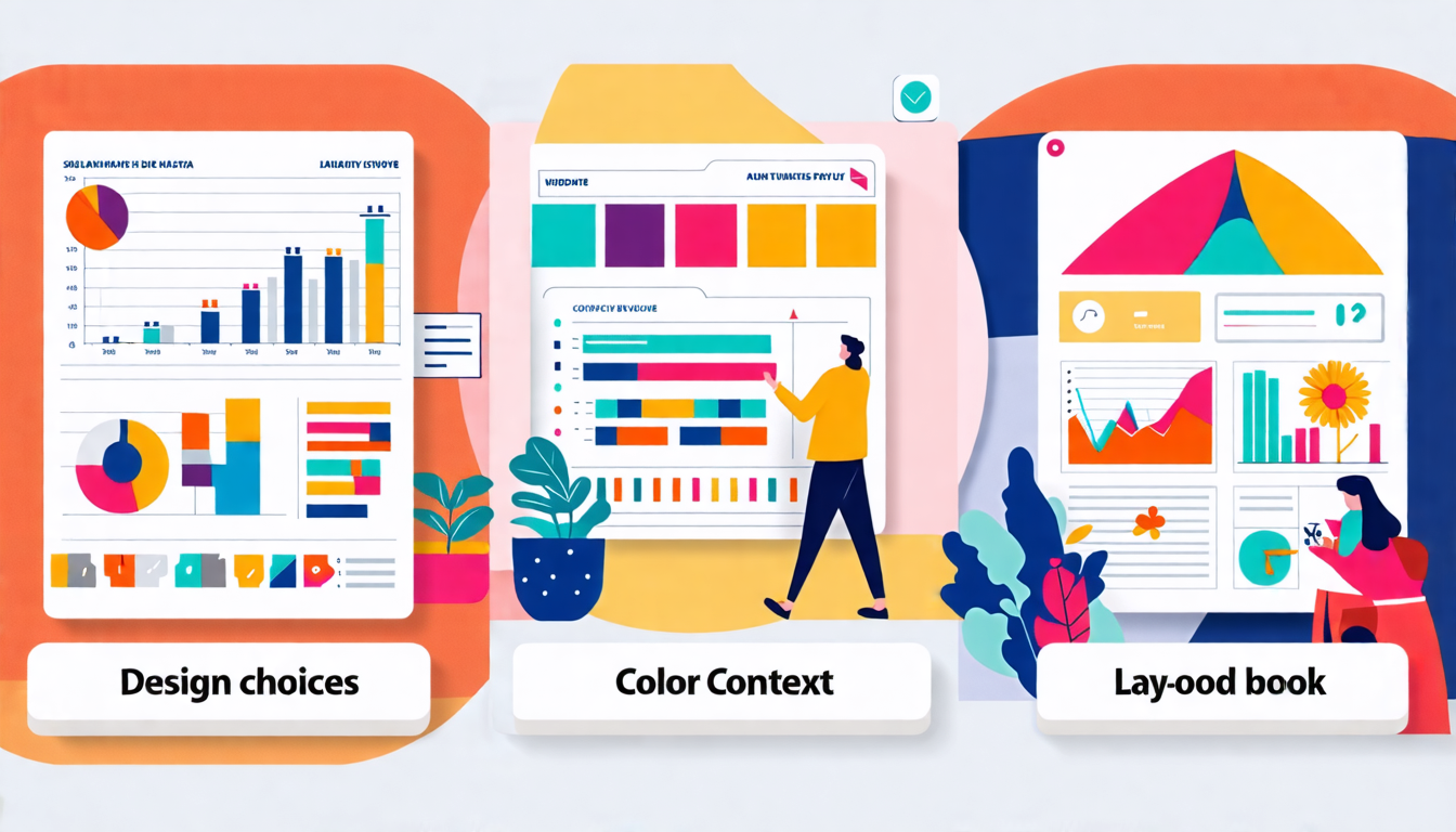
Tips for Selecting Aesthetic Designs for Different Contexts
Adapting Aesthetic Choices for Various Platforms: Web Design, Mobile Applications, and Print Media
When selecting aesthetic designs, it’s crucial to consider the platform on which the design will be presented. The visual requirements and constraints of web design, mobile applications, and print media are distinct, and tailoring your design choices to align with these contexts can enhance the overall impact and user engagement.
Web Design
In web design, a responsive and visually appealing layout is paramount. This requires careful consideration of elements such as:
- Readability: Ensure fonts are legible against the background, and the text size is appropriate for different screen resolutions. Sans-serif fonts often work best for web content due to their clarity on screens.
- Navigation: Clear, intuitive navigation is essential. Incorporate aesthetically pleasing navigation bars and buttons that guide users seamlessly through the site. Minimalistic designs often work well by reducing clutter and focusing on essential elements.
- Loading times: High-resolution images and intricate designs can slow down page load times. Optimize images and use web-safe fonts to maintain the aesthetic without compromising performance. Techniques like lazy loading can also help in maintaining a balance between design and functionality.
- Color schemes: Choose colors that convey your brand’s message and appeal to your target audience. Web-safe color palettes ensuring consistency across various devices and browsers can make a significant difference.
- Whitespace: Effective use of whitespace can enhance readability and direct attention to key areas without overwhelming the user.
Mobile Applications
Mobile applications require a different approach given the smaller screen size and touch-based interaction. Key considerations include:
- Touch-friendly interface: Design elements need to be easily tappable. Ensure buttons and interactive elements are of adequate size and placed where they can be easily accessed, especially for users with larger fingers.
- Simplicity: Due to limited screen space, prioritize essential content and features. Avoid overcrowding the interface with too many elements. Use a clean and straightforward design that’s easy to navigate.
- Consistent design language: Maintain a consistent aesthetic throughout the app to provide a seamless user experience. Use platform-specific guidelines like Google’s Material Design for Android or Apple’s Human Interface Guidelines for iOS.
- Legible text: Font sizes should be large enough to read on small screens without strain. Color contrast should enhance readability in varying lighting conditions, including outdoor use.
- Resolution and responsiveness: Ensure that images and icons are sharp and clear on all screen resolutions, from standard displays to high-definition screens.
Print Media
Print media designs cater to a different set of aesthetic principles due to their physical nature. Key factors include:
- High-resolution images: Print requires images to be in higher resolutions (300 dpi or higher) for clarity and sharpness.
- Color accuracy: Colors in print can differ from those on digital screens. Use CMYK color mode for accurate color reproduction in printing. Consider how colors will appear when printed on various types of paper and finishes (glossy, matte, etc.).
- Typography: Choose fonts that are easy to read at different sizes and distances. Serif fonts are often preferred in print for their readability in long texts. Ensure there is enough contrast between text and background.
- Layout and margins: Leave adequate margins to maintain a neat, professional appearance and avoid cutting off text or images. Grid-based layouts can help in organizing content systematically.
- Material considerations: The choice of paper, texture, and weight can influence the overall aesthetic and feel of the printed material.
Incorporating User Experience (UX) Best Practices to Enhance Aesthetic Appeal
The aesthetic appeal of a design is significantly influenced by its usability and user experience (UX). Good UX design can make an aesthetically pleasing design more effective by ensuring it’s intuitive and user-friendly.
User-Centered Design
Start by understanding your audience’s needs and preferences. Conduct user research to gather insights into what your users find visually appealing and easy to use. Create personas to represent different segments of your audience and tailor your design choices to meet their specific needs.
Intuitive Navigation
Navigation should be straightforward and intuitive. Use visual cues such as arrows, icons, and breadcrumbs to guide users. A well-structured layout with clear hierarchies ensures users can find what they need quickly and easily, enhancing both their experience and the design’s aesthetic.
Feedback and Interactivity
Incorporate elements of feedback and interactivity such as hover states, clickable buttons, and animations. These elements make the design more engaging and provide users with immediate responses to their actions, creating a more satisfying interaction.
Consistency
Consistency in design elements like colors, fonts, and icons across various parts of your platform creates a cohesive and polished look. Consistent use of design patterns helps users predict how elements behave, making their experience smoother and more enjoyable.
Accessibility
Ensuring your design is accessible to all users, including those with disabilities, is crucial. Opt for high contrast between text and background, larger fonts, and navigable keyboard interfaces. Use alt text for images and ensure screen readers can accurately interpret your content. Accessible designs are not only more inclusive but also enhance the overall aesthetic by making the content clear and reachable to a broader audience.
Performance and Speed
Aesthetic designs should not compromise your platform’s performance. Optimize images and streamline code to ensure quick load times. Fast, responsive designs enhance user satisfaction and can positively influence the perception of your aesthetics.
By integrating these UX best practices, you can create designs that are not only aesthetically pleasing but also functional, user-friendly, and efficient. This combination of beauty and usability is the cornerstone of effective and compelling design.
In conclusion, selecting aesthetic designs involves a deep understanding of core design principles such as balance, contrast, harmony, and proportion. By applying these principles effectively, it’s possible to create designs that are not only visually appealing but also functional and engaging. Color theory plays a crucial role in this process, helping to evoke the right emotions and interactions from users.
When choosing aesthetic designs for different contexts, adaptability is key. Web design, mobile applications, and print media each come with their own set of challenges and opportunities, requiring tailored approaches to ensure the design fits the medium effectively. Incorporating user experience (UX) best practices is paramount in enhancing aesthetic appeal; this involves understanding and anticipating user needs and behaviors to create designs that are both beautiful and intuitive.
Ultimately, a well-chosen aesthetic design is a blend of artistic and technical skill, guided by thoughtful consideration of the context and user experience. By adhering to these principles and tips, you can achieve designs that are not only pleasing to the eye but also impactful and effective in their intended purpose.